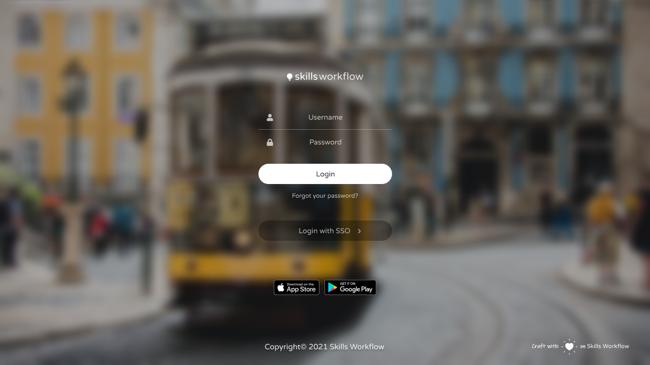
Login design guidelines
When logging in, the user has 2 action paths with separate pages with dedicated views specifically designed for optimal experience. Users that always perform one of the logins, navigates always to the same view:
- SSO - The user needs to use Single Sign On to login
- Native - The user uses the standard login with user and password
Branding is another one of the key features in the login pages. The company can use their branding, such as logo and background picture, to set the site to their own look and feel.
- Picture - Background image should use company branding
- Logo - The logo of the company, on top of the login
The login pages is also a great place to communicate exporadic events at the company. The background picture can be changed dynamically and quickly to portrait anything. Examples could be:
- Christmas
- New client
- Cause support
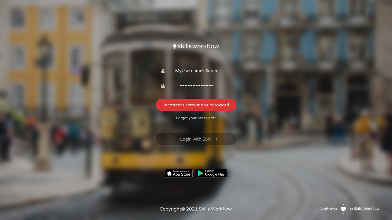
When there is a failure in the login, an error message is shown on top of the login button. Errors include failed login, or system failures. All iconic information should be achieved by using the Fontawesome font. At the bottom, there are the buttons to get the mobile application from the corresponding stores. The alignment of the boxes and text must be respected, so that the design looks consistent.