Set Columns
A function used to set grid's columns in a workspace.
By default, a column is created for each field of a data source object, but in most cases, it is redundant. To specify a set of columns to be created in a grid, assign an array specifying these columns to the columns property.
Each object in it configures a single column. If a column does not need to be customized, this array may include the name of the field that provides data for this column.
Each grid column is represented in this array by an object containing column settings or by a data source field that this column is bound to.
Column properties define the behavior and appearance of a grid column.
{
    entity: "client",
    format: {
        type: "image",
        mapping: {
            id: "ClientId",
            name: "ClientName",
            hasImage: "ClientHasImage"
        },
        properties: {
            hideName: true,
            size: "small",
            forceImage: false
        }
    },
    caption: "Client",
    dataType: "string",
    dataField: "ClientName",
    alignment: "center",
    width: 50,
    allowEditing: false
}
entity
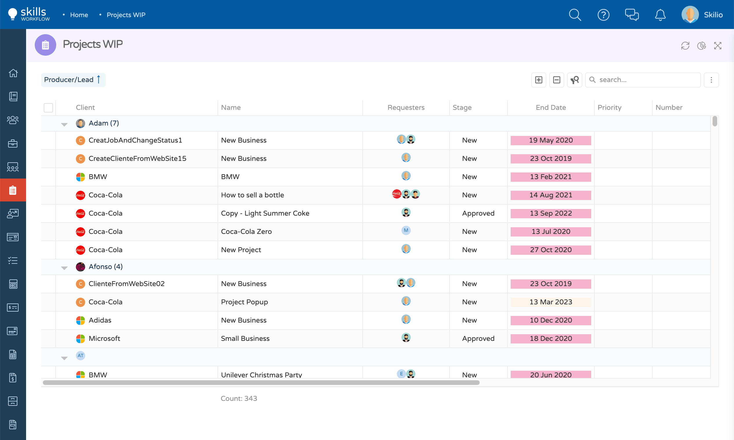
Setting up the Entity property, the standard display will be used. If the cell display needs to be configured, the format property allows defining other default displays according to the selected type. According to the type to be presented in the column, image, link or text, some additional fields must be available in the data source.
Accepted Values: 'client' | 'company' | 'stage' | 'user' | 'team'
- Client
- Company
- Stage
- User
- Team
- Entities with color
Basic Usage
{
  entity: "client";
}
Basic Usage
{
  entity: "company";
}
Basic Usage
{
  entity: "stage";
}
Basic Usage
{
  entity: "user";
}
Basic Usage
{
  entity: "team";
}
mapping
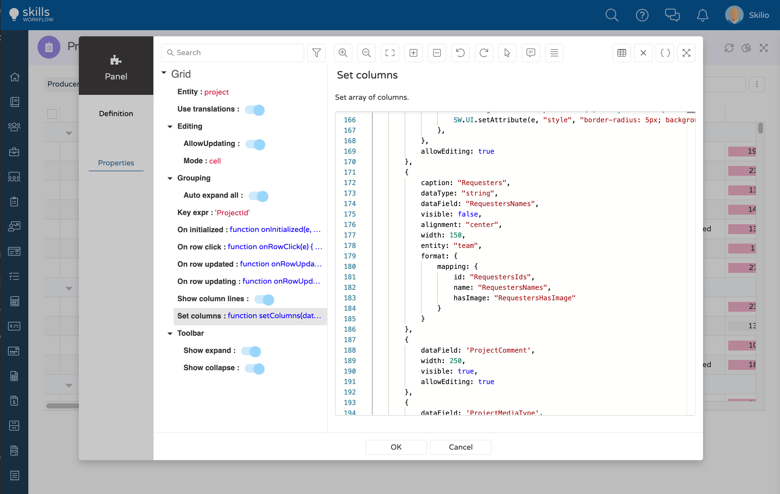
If the data source does not mapping to the defaults fields name, it can be mapped by using the mapping property:
{
    caption: "Requesters",
    dataType: "string",
    dataField: "RequestersNames",
    visible: false,
    alignment: "center",
    width: 150,
    entity: "team",
    format: {
        mapping: {
            id: "RequestersIds",
            name: "RequestersNames",
            hasImage: "RequestersHasImage"
        }
    }
}
Example
Description
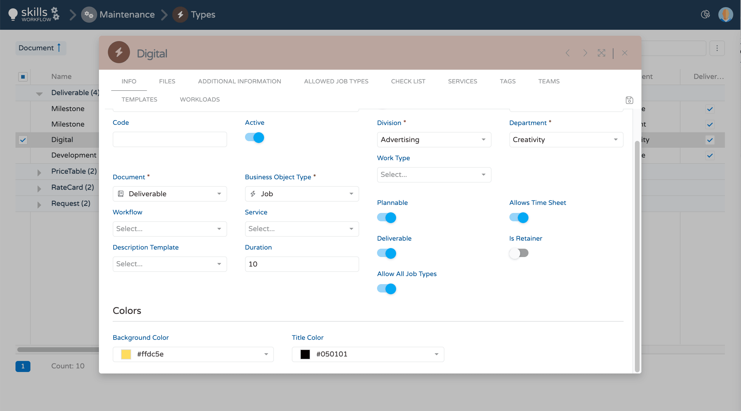
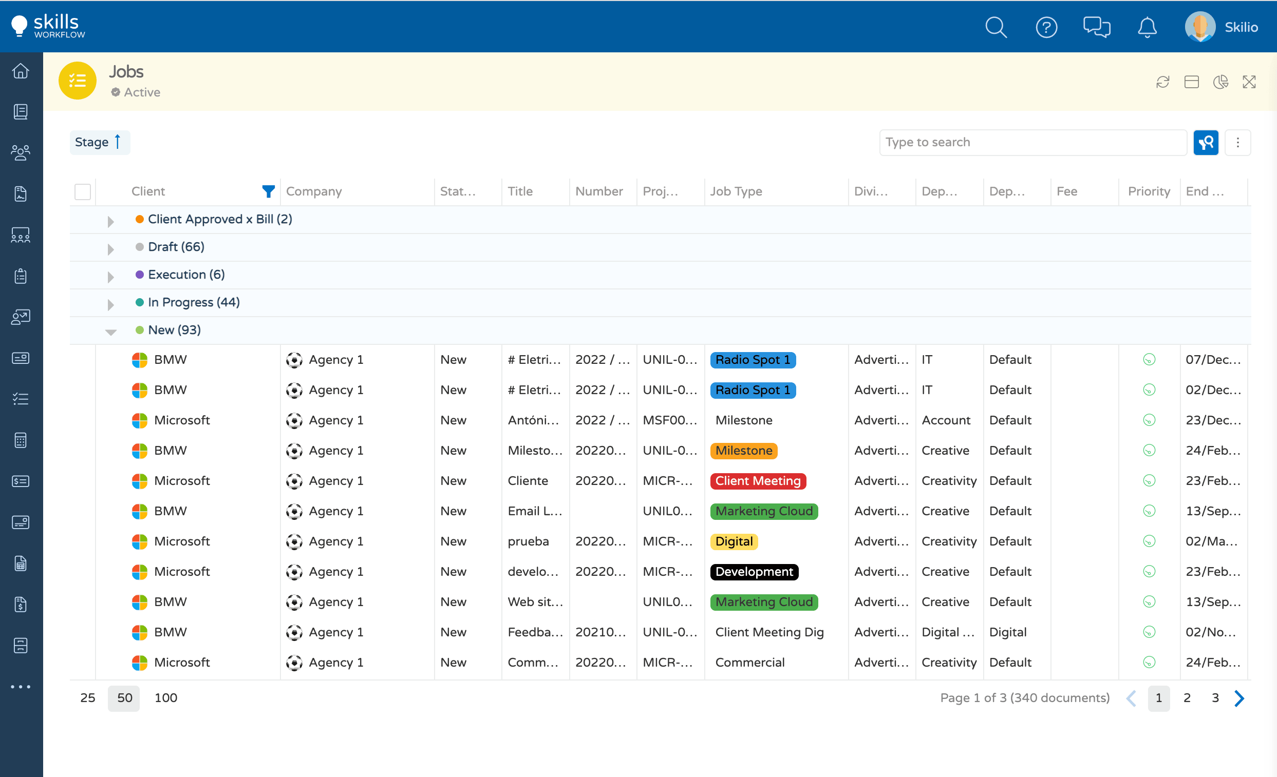
Customize the text and the background of the type's label using the column's entity.
By default the background color appears without color and the text appears in black.
To choose the color for each entity, first you need to go to the maintenance and define the colors for the background and the text
Accept entities: "jobtype" | "leavetype"
Basic Usage
| Column name | Type | Required | Description |
|---|---|---|---|
StyleJson | Json | true | Add the column StyleJson in the DataSource |
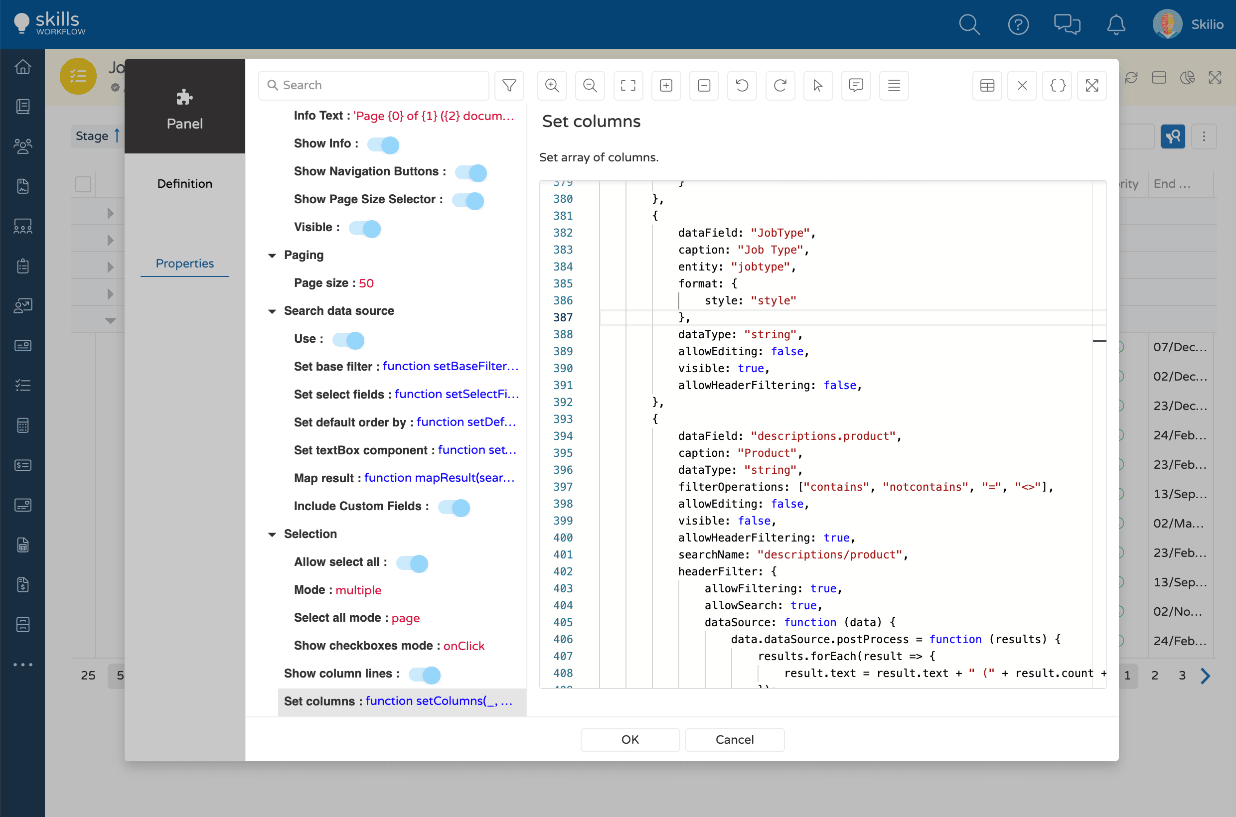
{
    dataField: "JobType",
    caption: "Job Type",
    entity: "jobtype",
    format: {
        style: "style"
    },
    dataType: "string"

}
Example
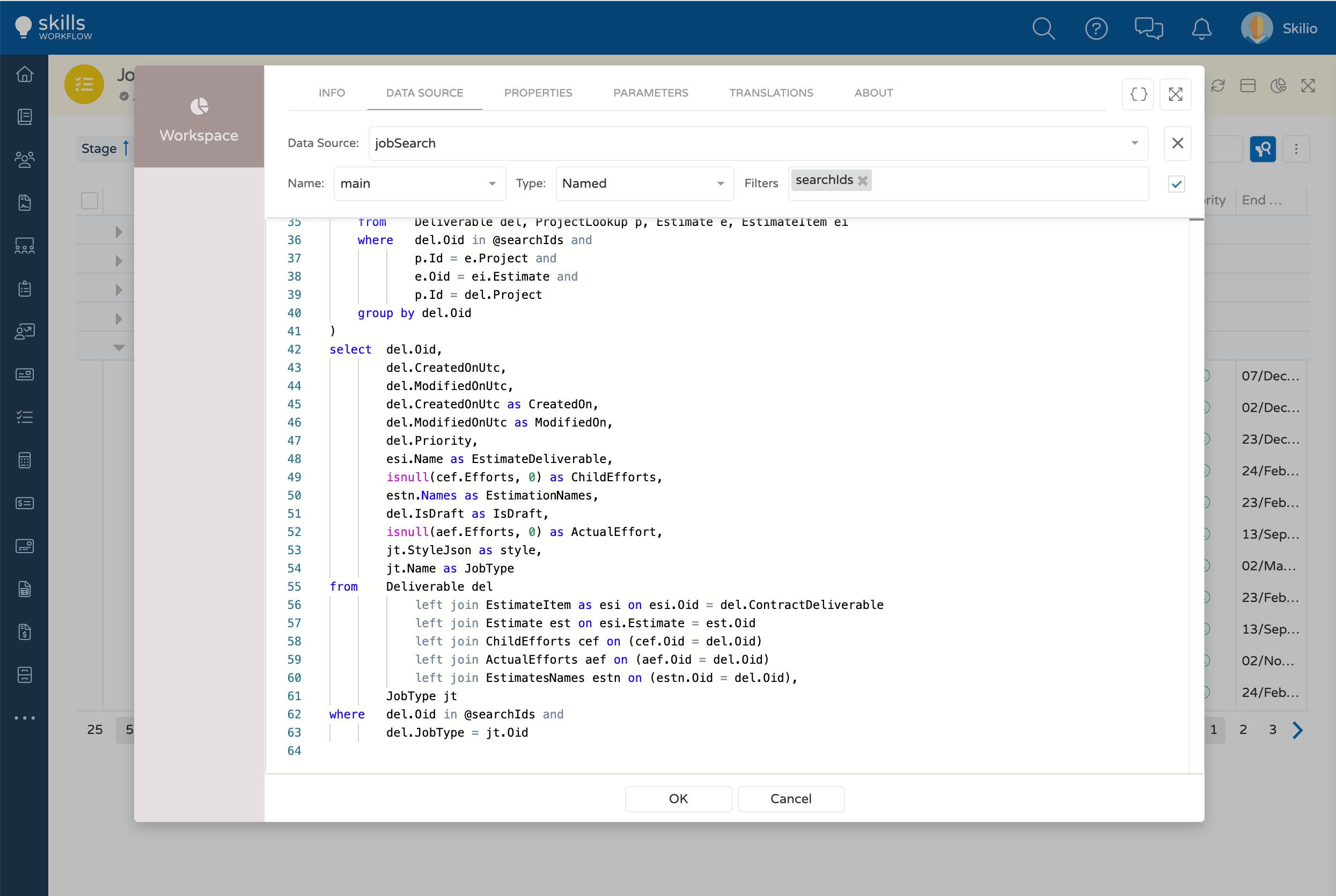
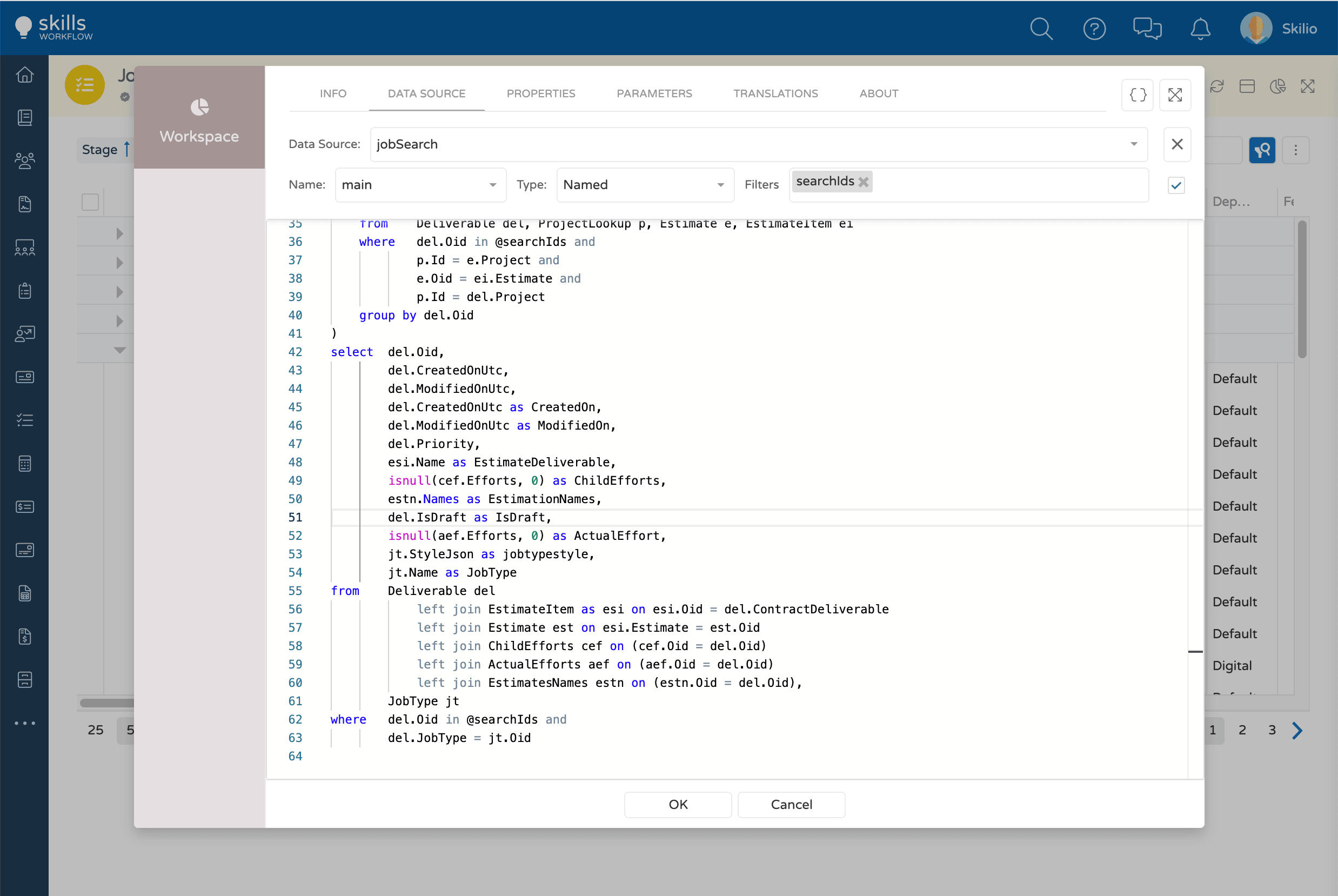
To use the entity without the format, the dataSource expects the "name of the entity + style" as column name.
format
Formats the cell before it is displayed.
There are some standard formats available. By specifing its type the corresponding format will be displayed.
type
Accepted Values: 'undefined' | 'image' | 'link' | 'document' | 'date' | 'currency' | 'read' | 'priority' | 'stage'
To setup the Image type, it is necessary that data source includes the entity:
- Id
- Name
- HasImage
- Image
- Link
- Document
- Date
- Currency
- Read
- Priority
- Stage
Basic Usage
{
    entity: "client",
    format: {
        type: "image"
    }
}
properties
Properties withing format property customize the behavior and appearance of a default display.
{
    entity: "client",
    format: {
        type: "image",
        properties: {
            hideName: true,
            size: "small"
        }
}
hideName:
To hide the client name from the column and keep only the client image, set this property as true.
size:
To define the size of the image.
Accepted Values: 'small' | 'medium' | 'large'
Example
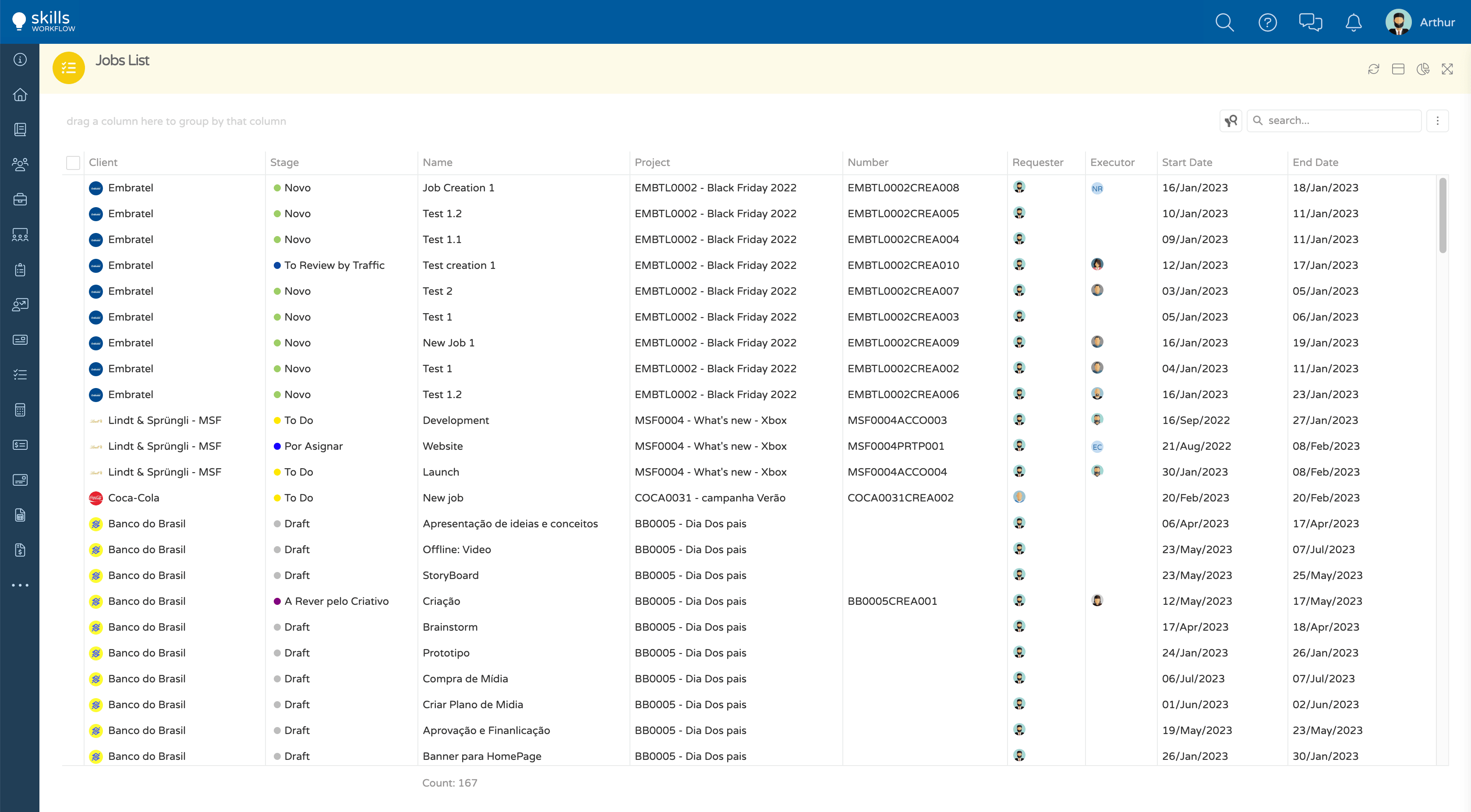
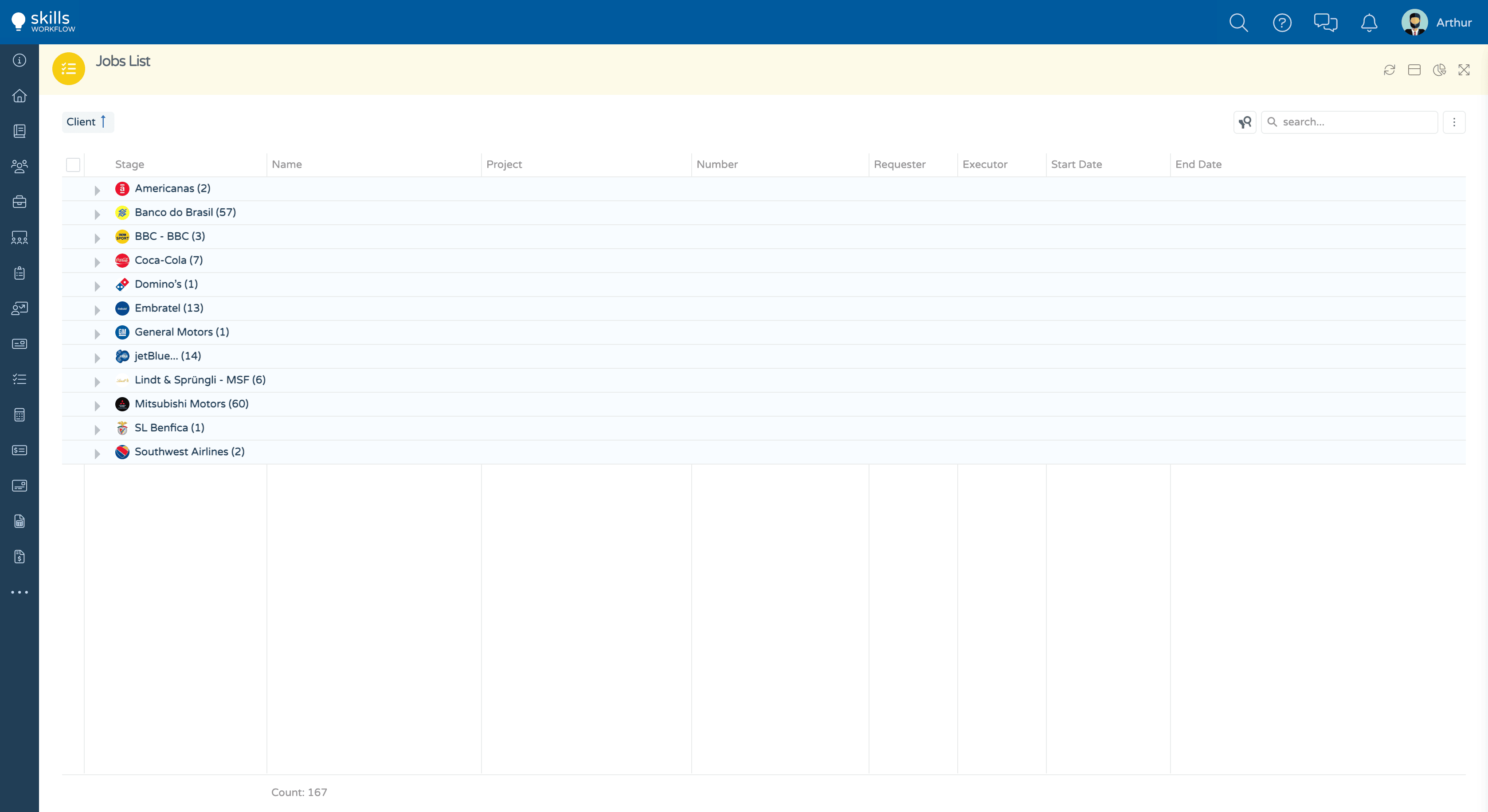
Basic Usage
{
    entity: "client",
    format: {
        type: "link"
    }
}
Basic Usage
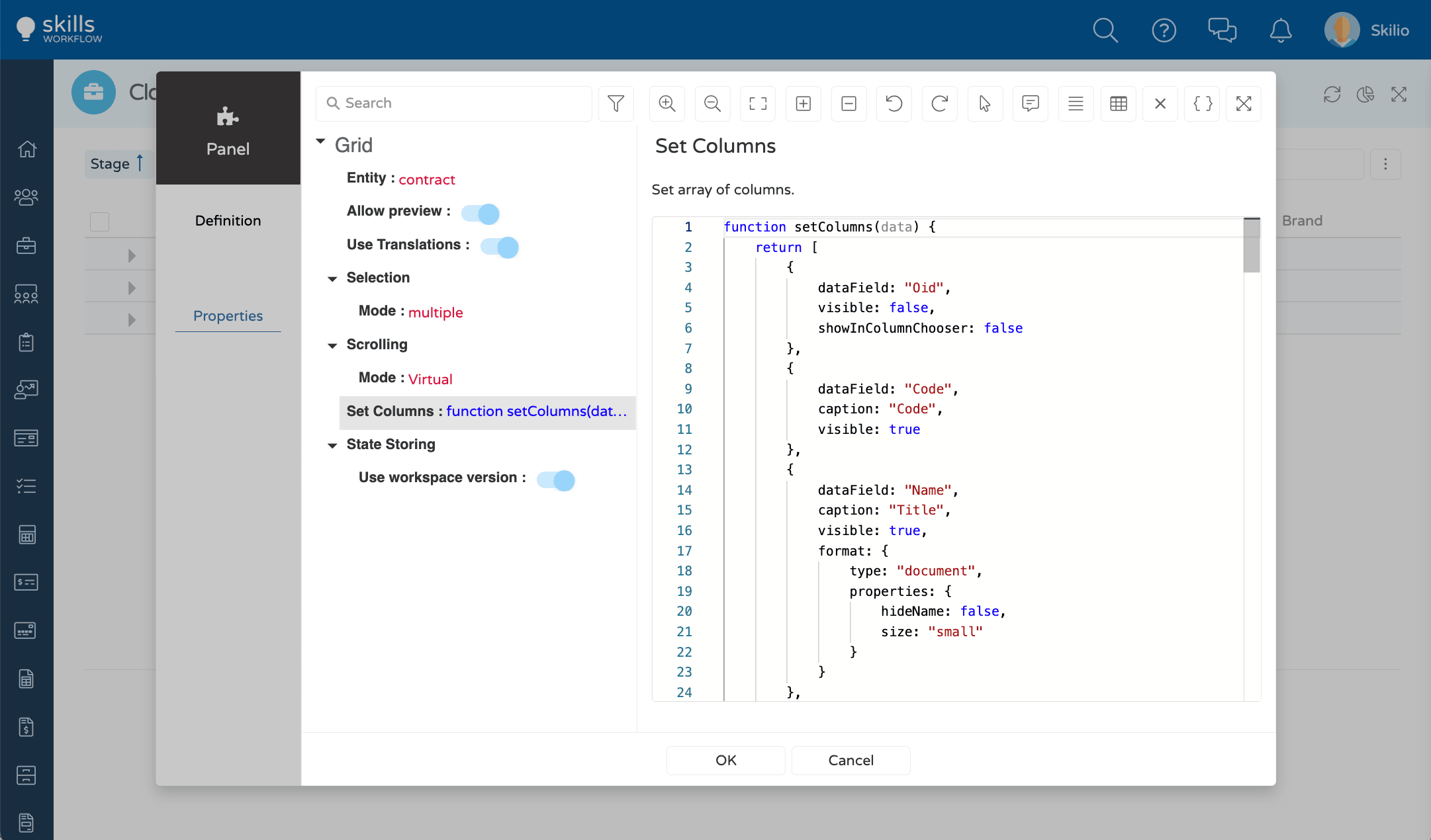
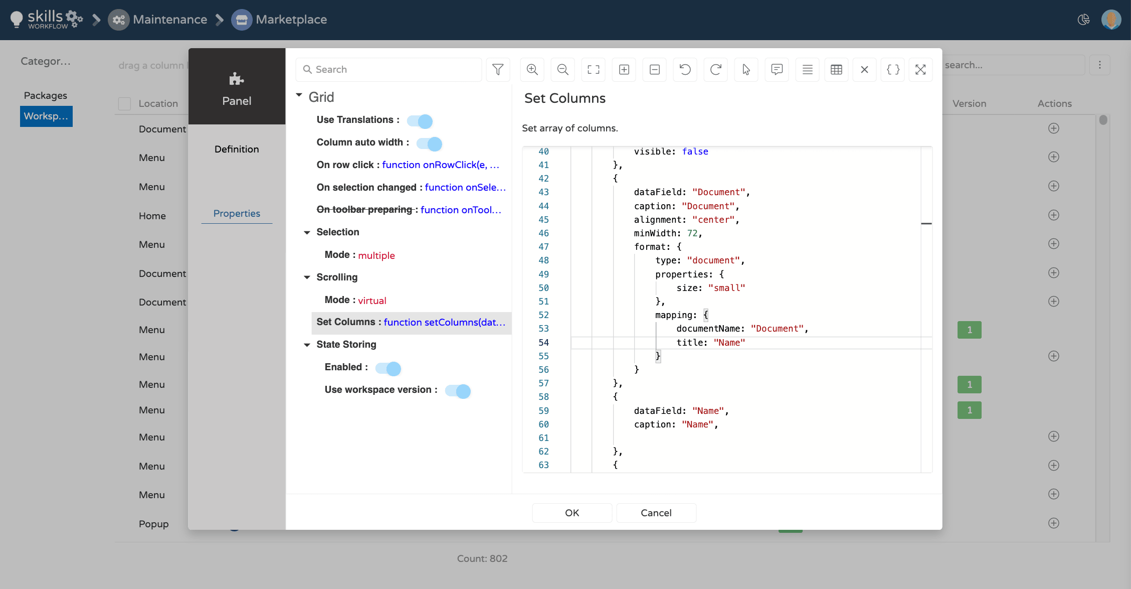
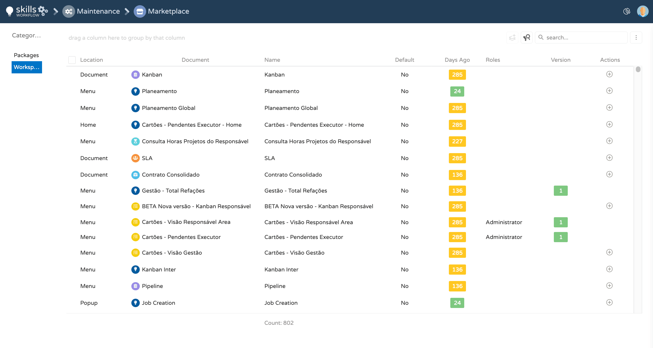
The follow examples shows how to display the name and the image of the document together.
- With entity defined.
{
    dataField: "Name",
    caption: "Title",
    format: {
        type: "document",
        properties: {
            hideName: false,
            size: "small"
        }
    }
}
- Without entity defined.
{
    dataField: "Document",
    caption: "Title",
    format: {
        type: "document",
        properties: {
            hideName: false,
            size: "small"
        },
        mapping: {
            documentName: "Document",
            title: "Name"
        }
    }
}
properties
documentName:
The name defined in the dataField.
title:
Define the name that appears in the UI. Could be different of the name of the dataField.
Example
Basic Usage
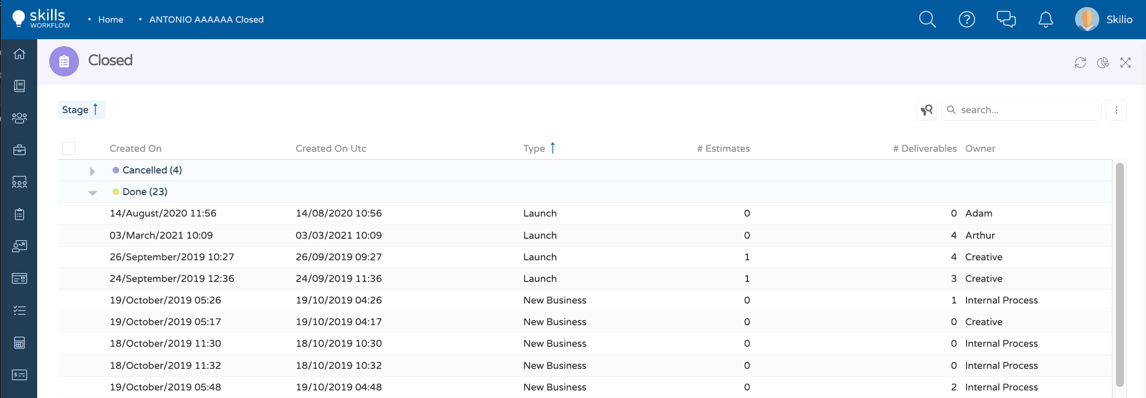
The follow example shows how to convert an UTC date into local.
By default the date is converted from Utc into local in the format "DD/MMMM/YYYY HH:mm".
{
    dataField: "CreatedOnUtc",
    caption: "Created On",
    format: {
        type: "date"
    }
}
properties
The following examples shows how to customize de appearance of the default behavior.
format:
Customize the format of the date in the UI.
{
    dataField: "CreatedOnUtc",
    caption: "Created On",
    format: {
        type: "date",
        properties: {
          format:  "DD/MMM/YYY"
    }
}
| Format | Type | Required | Example |
|---|---|---|---|
"HH:mm" | string | false | 12:06 |
"DD/MM/YYYY" | string | false | 12/05/2022 |
"DD/MM/YYYY HH:mm" | string | false | 12/05/2022 12:06 |
"DD/MMM/YYYY HH:mm" | string | false | 12/May/2022 12:06 |
displayInUtc:
Allows to display the date in UTC.
{
    dataField: "CreatedOnUtc",
    caption: "Created On",
    format: {
        type: "date",
        properties: {
          format:  "DD/MMM/YYY",
          displayInUtC: true
        }
    }
}
Example
enableColoring
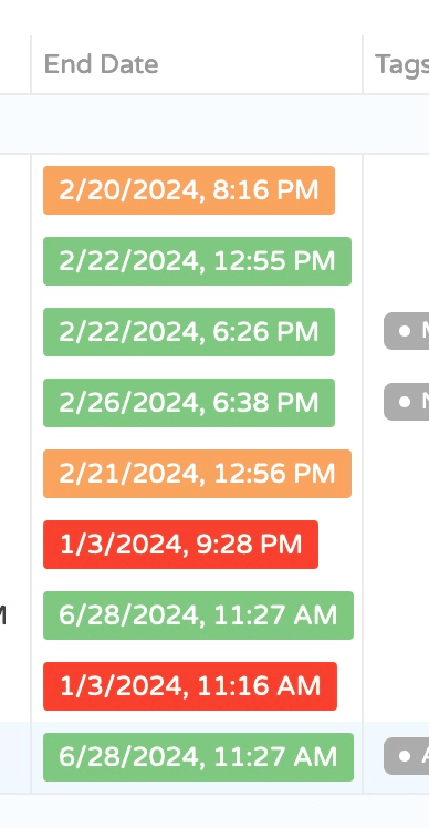
If enabled, it sets the background color of a date according to the following conditions:
- Red, if the date has already expired;
- Orange, if the date is due in two or less days;
- Green, if the date is due in more than 2 days.
{
    dataField: "CreatedOnUtc",
    caption: "Created On",
    format: {
        type: "date",
        enableColoring: true
    }
}
Example
Basic Usage
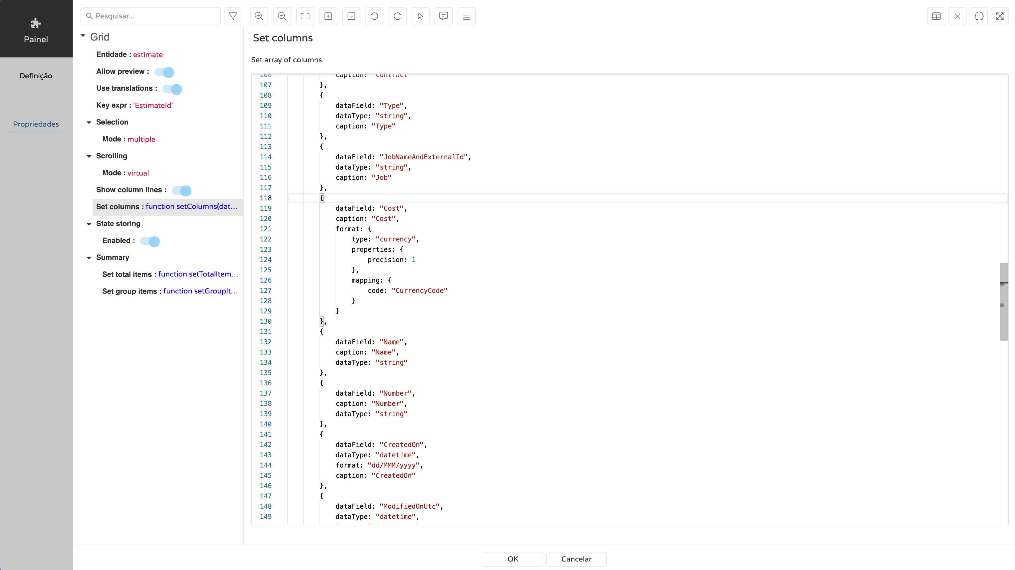
The follow examples shows how to display the currency symbol in a currency column.
{
    dataField: "Cost",
    caption: "Cost",
    format: {
        type: "currency",
        properties: {
            precision: 1
        },
        mapping: {
            code: "CurrencyCode"
        }
    }
}
properties
precision:
To choose how many decimal places are shown.
symbol:
The data field name that has the currency symbols.
Example
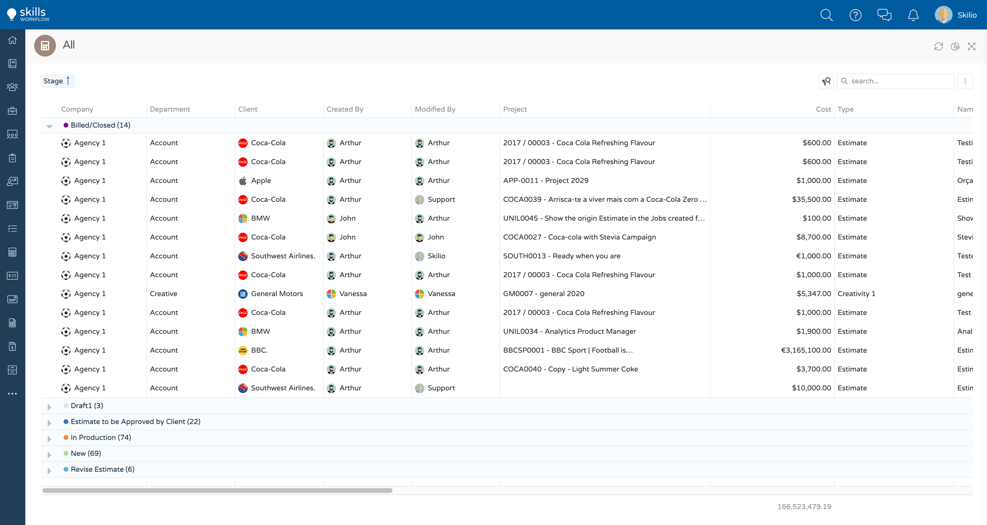
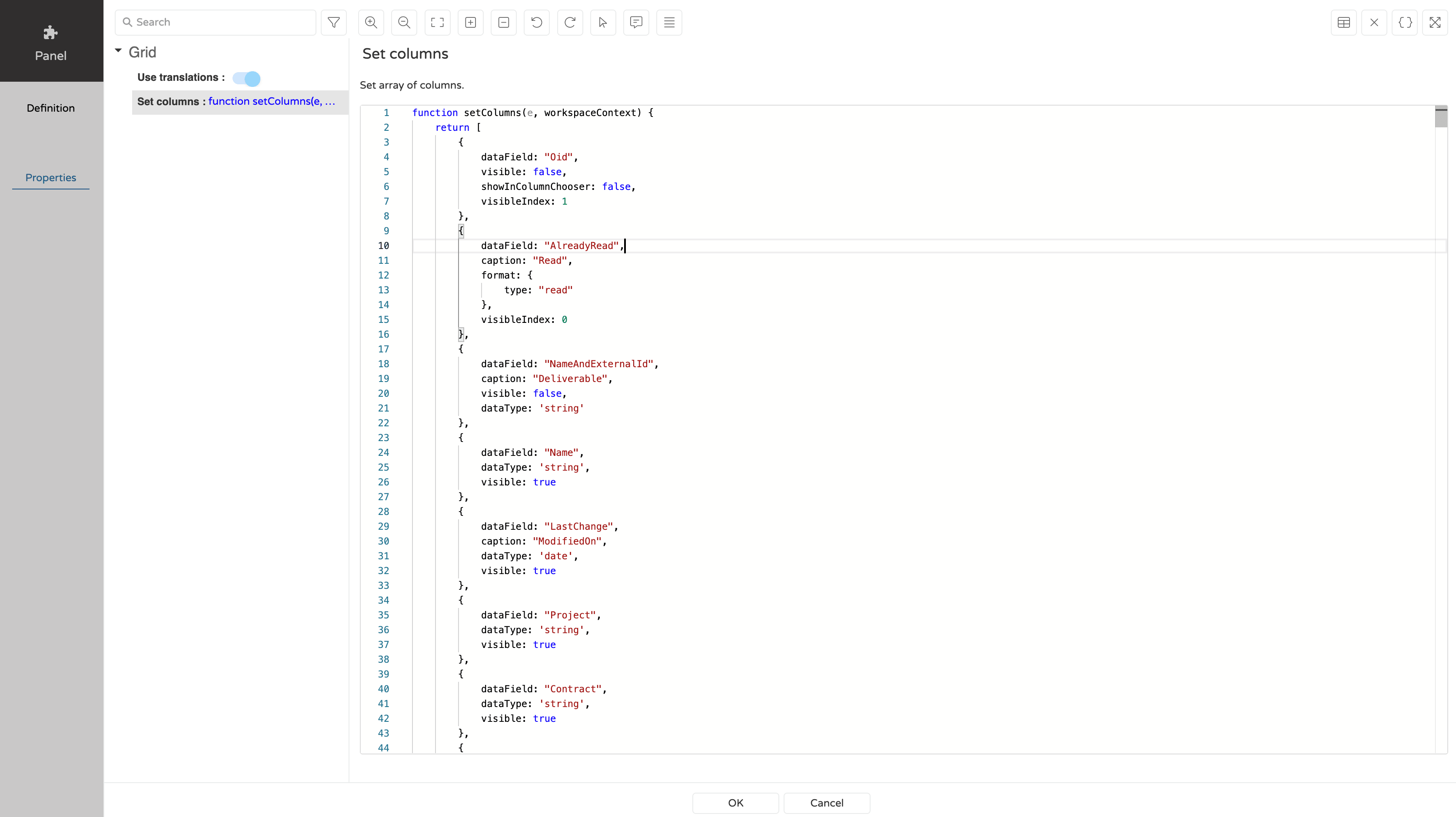
The follow examples shows how to display the read/unread symbol in a boolean column.
{
    dataField: "AlreadyRead",
    caption: "Read",
    format: {
        type: "read"
    }
}
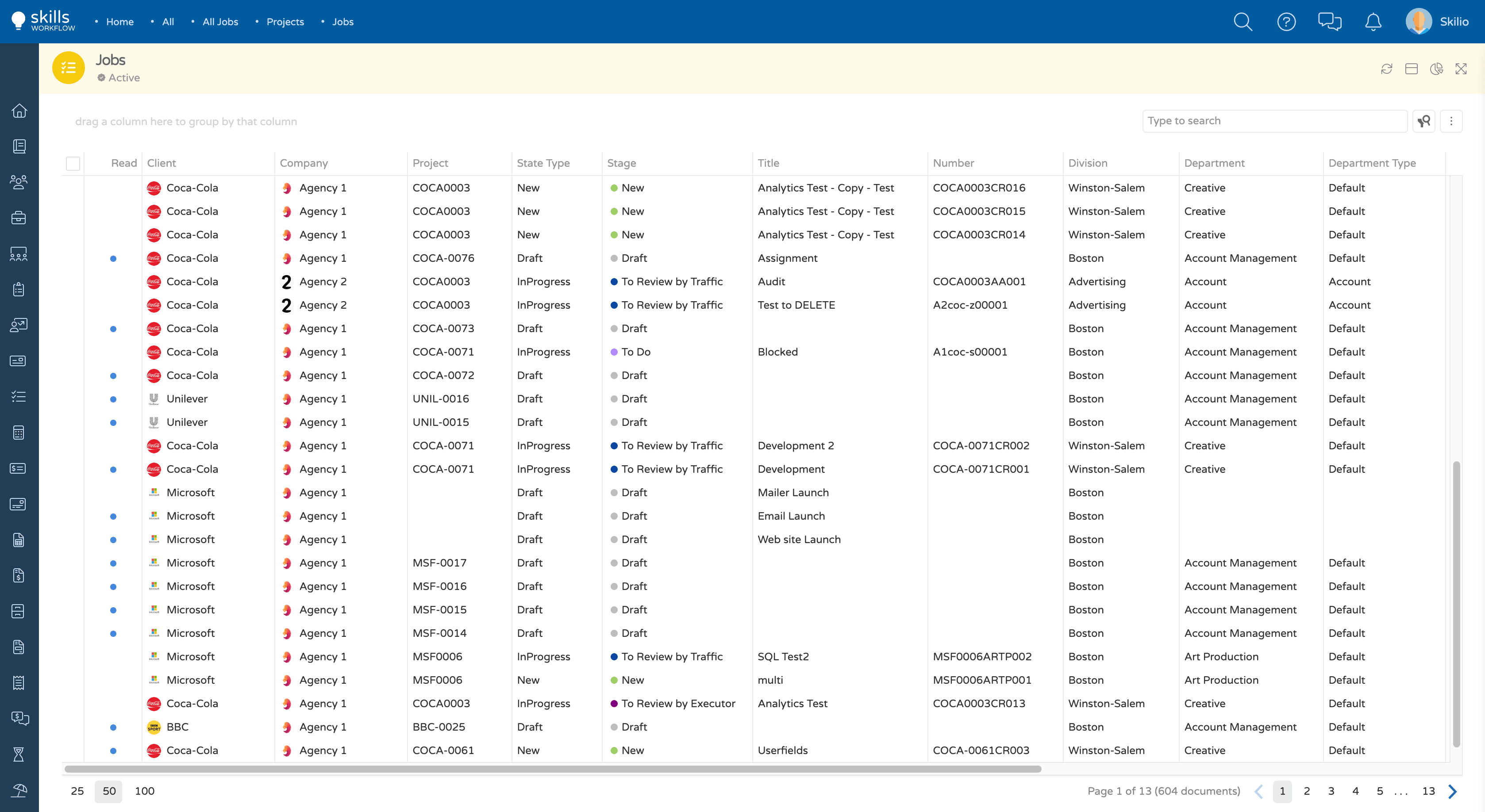
The follow example shows how to display the priority type.
{
    dataField: "Priority",
    caption: "Priority",
    dataType: "number",
    format: {
        type: "priority"
    }
}
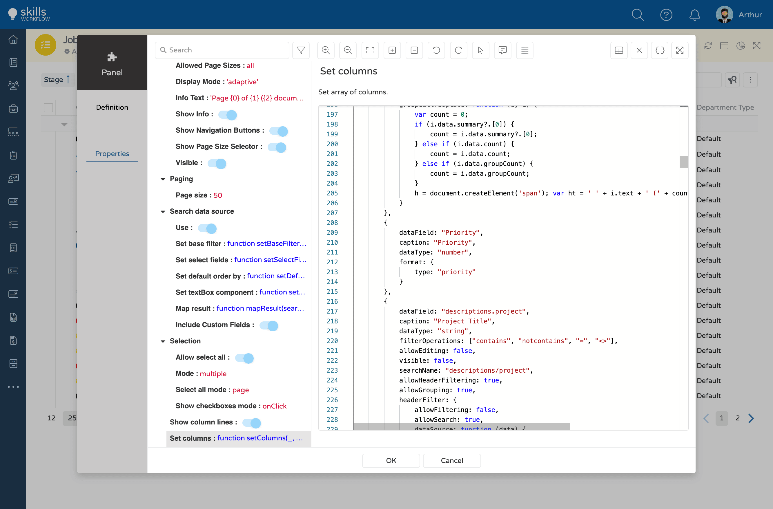
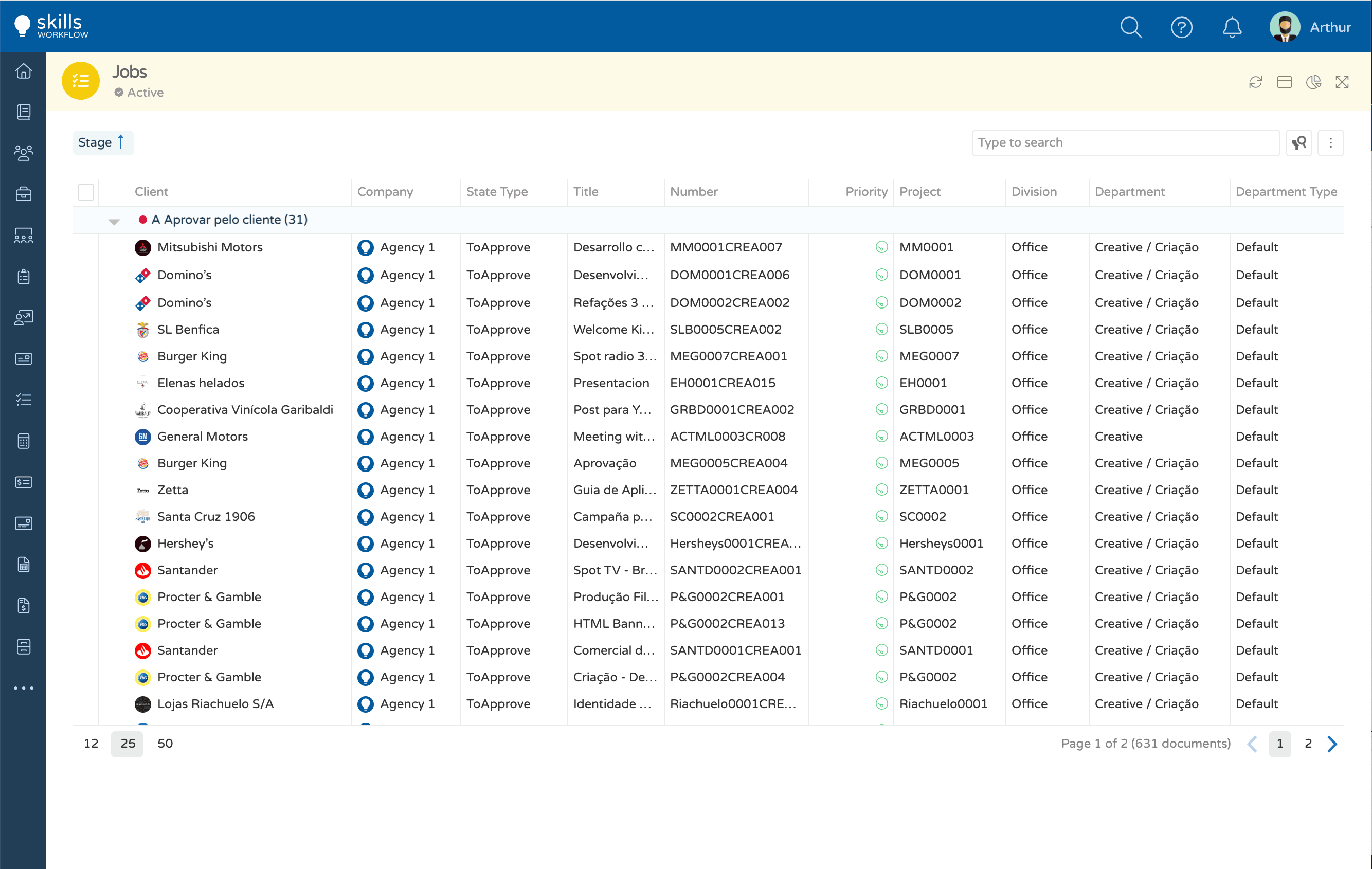
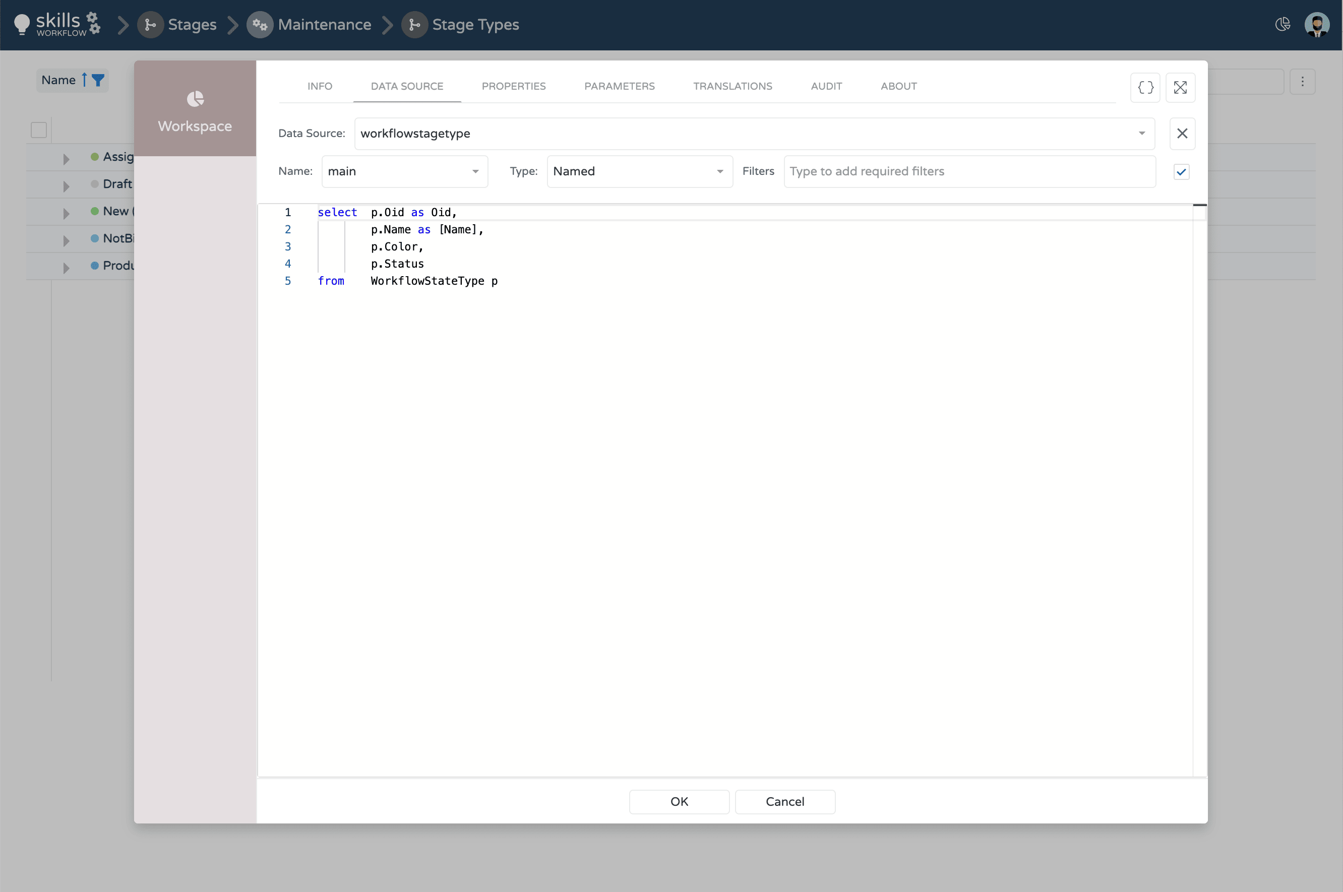
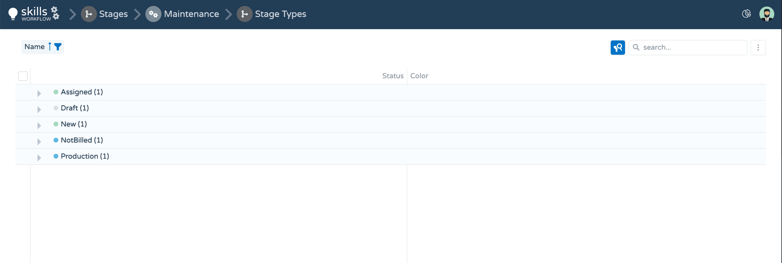
The follow examples shows how to display the stage type.
{

    dataField: "Name",
    entity: "stage",
    format: {
        mapping: {
            color: "Color",
            name: "Name"
        }
    }
}
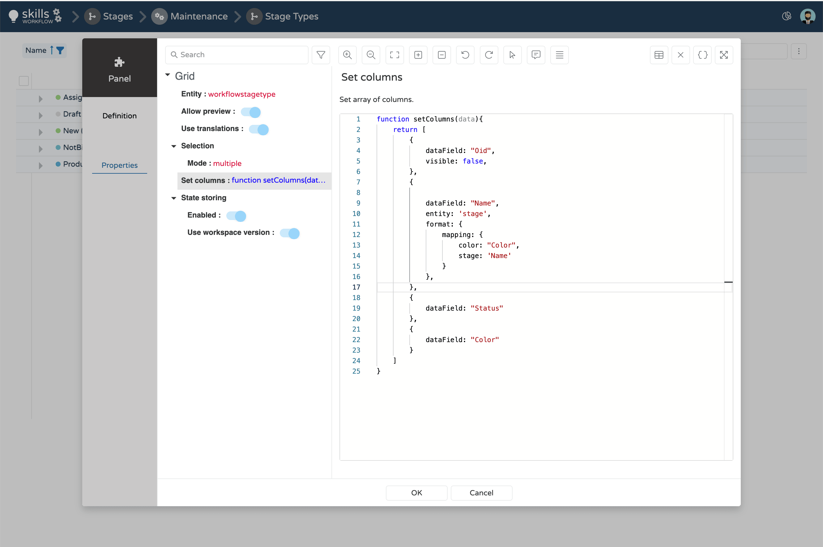
properties
stage
A property to map the name of the stage.
color
A property to map the color of the stage.
caption
Specifies a caption for the column.
dataType
Casts column values to a specific data type
Accepted Values: 'string' | 'number' | 'date' | 'boolean' | 'object' | 'datetime'
dataField
Binds the column to a field of the dataSource.
alignment
Aligns the content of the column
Accepted Values: undefined | 'center' | 'left' | 'right'
width
Specifies the column's width in pixels or as a percentage. Ignored if it is less than minWidth.
Type: Number | String
The property supports the following types of values:
- Number - The column's width in pixels.
- String - A CSS-accepted column width measurement (for example, "55px", "80%" and "auto") except relative units such as em, ch, vh, etc.
allowEditing
A flag to allow column editing
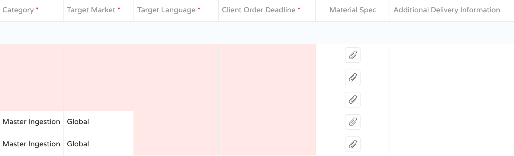
required
Makes a column required to fill
Type: Boolean
{
    dataField: "example",
    required: true
}
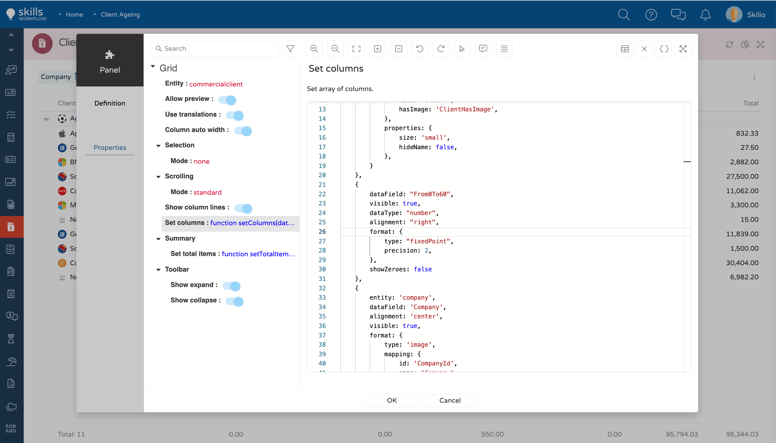
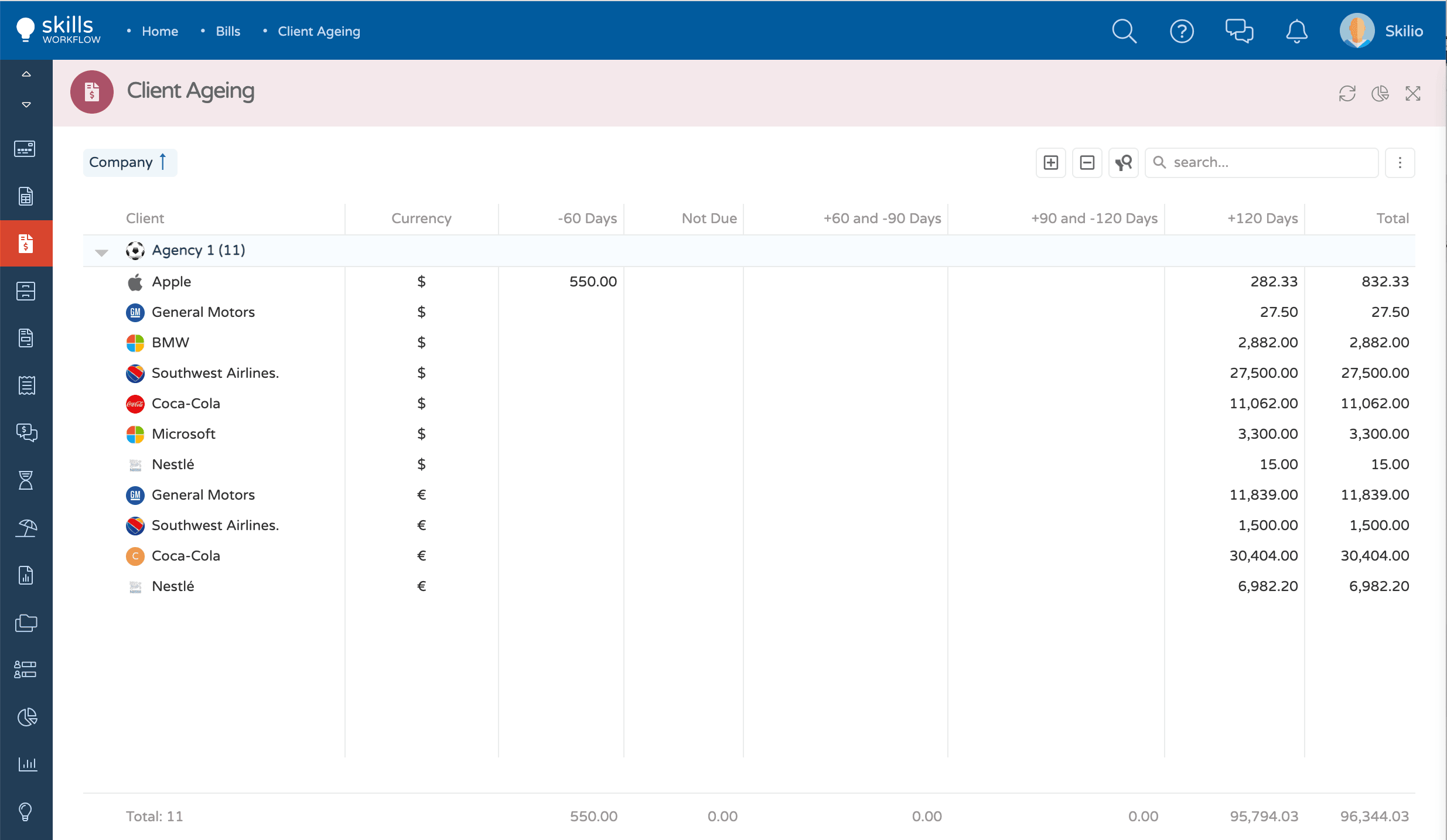
showZeroes
show or hide the zeroes values
Type: Boolean
 {
        dataField: "From0To60",
        visible: true,
        dataType: "number",
        alignment: "right",
        format: {
            type: "fixedPoint",
            precision: 2,
        },
        showZeroes: false
}
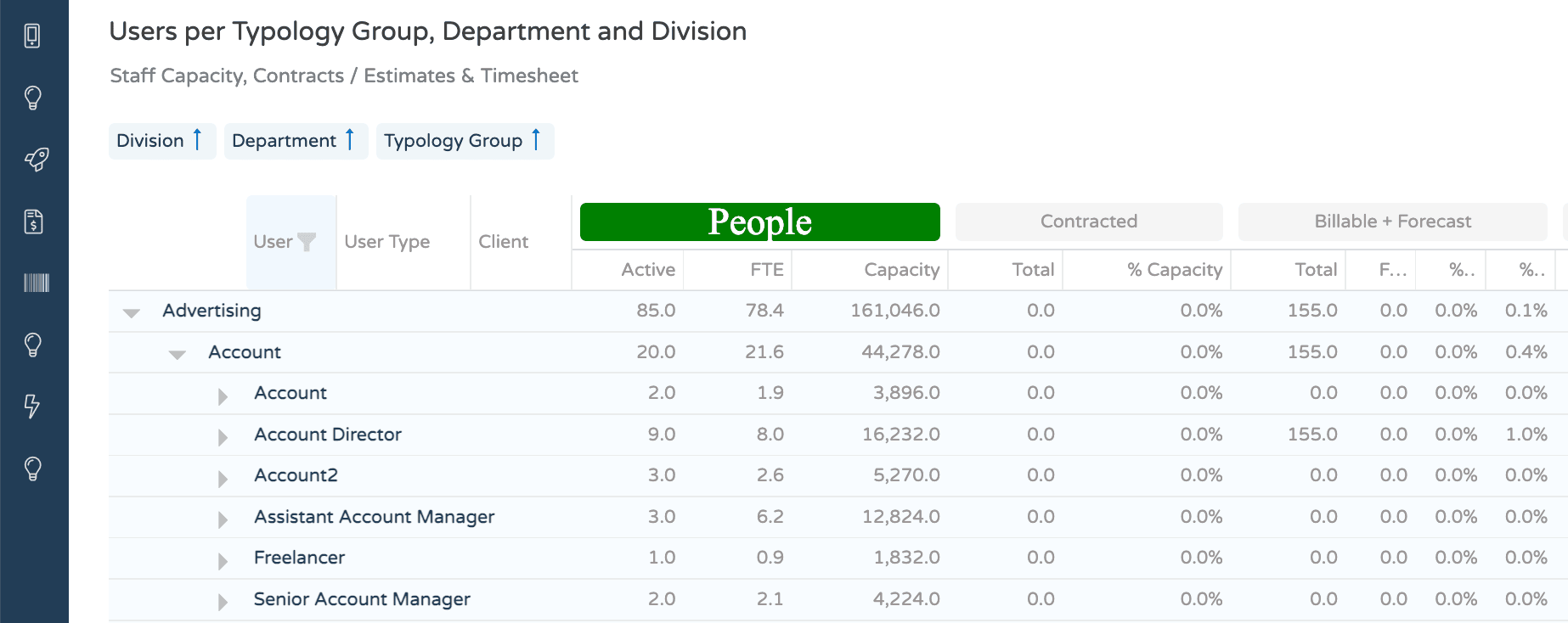
header
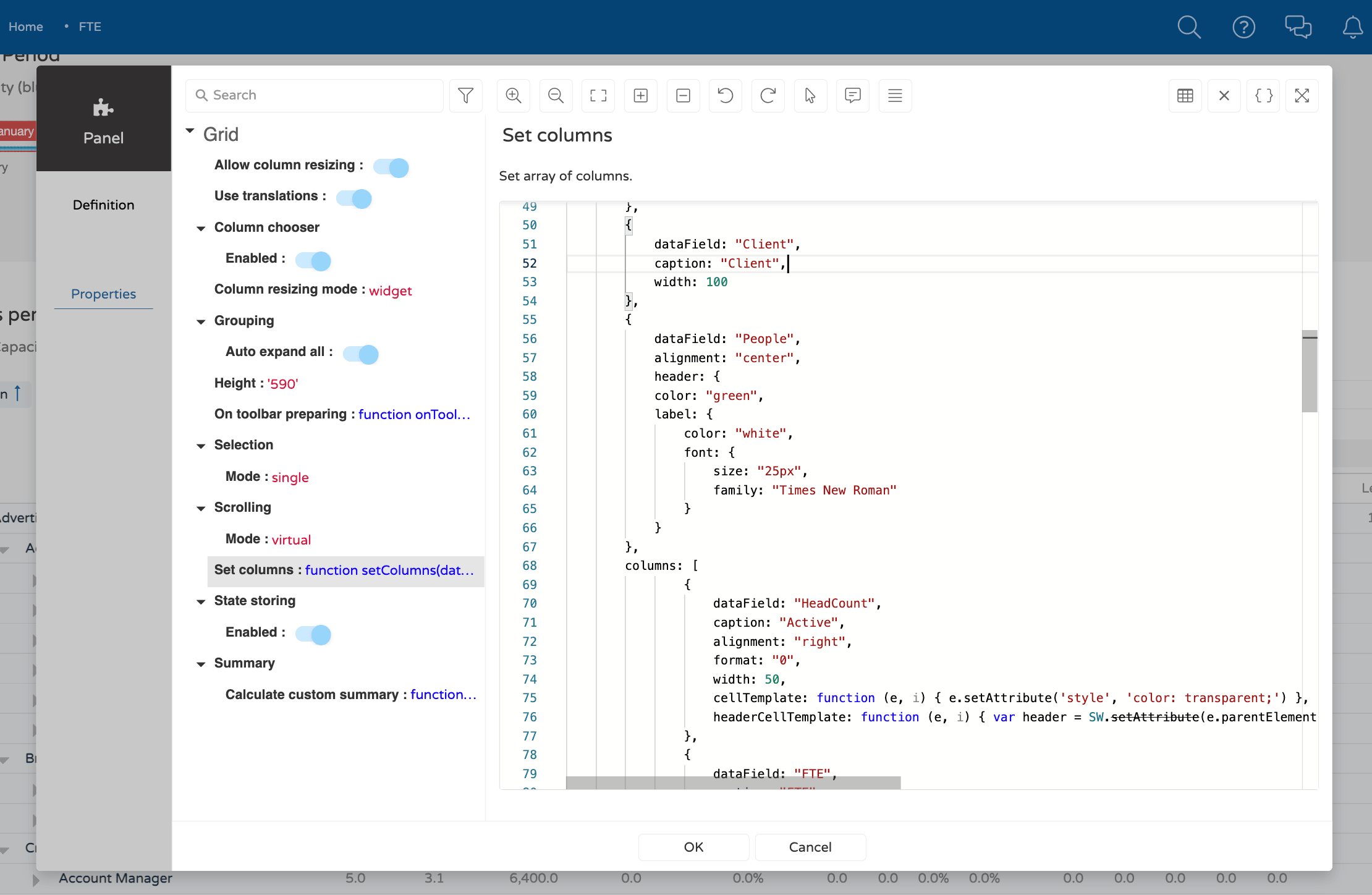
Customize the column header's
by default the background color is grey and the label has the the default style of the system.
Type: object
{
    dataField: "People",
    alignment: "center",
    header: {
        color: "green",
        label: {
            color: "white",
            font: {
                size: "25px",
                family: "Times New Roman"
            }
        }
    }
}
color
Change the background color of the Header.
Type: string
Accepted Values: name of the color, HEX code, RGB code
label
Customize the label of the column.
Type: object
color
Change the color of the text.
Type: string
Accepted Values: name of the color, HEX code, RGB code
font
Change the font's size and family.
Type: string
- size: the value must be in pixels
- family: font's family name
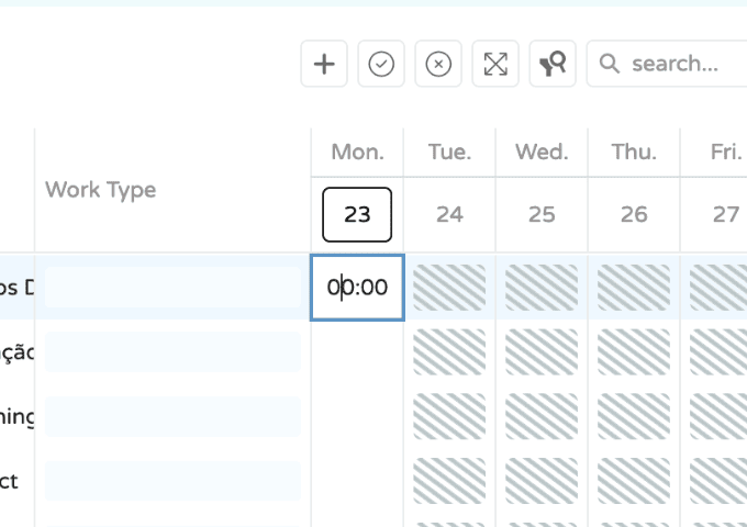
caretPosition
When setting the property, it will set the cursor in a certain position. By representing the cursor with a | , please check the example below:
- editorOptions:
{caretPosition: 0}the cursor will be placed in the position 0 = |00:00 - editorOptions:
{caretPosition: 1}the cursor will be placed in the position 1 = 0|0:00
{...
    editorOptions: {
        caretPosition: 1
    }
}