Environment
It is now possible to change the appearance of Skills Workflow. Make it look like your agency, differentiate it from the others and show your brand identity to all your team and clients.
This can be done through the Environment Dashboard. In order to access it, Users must have the following profiles linked to their profile:
- MaintenanceNavigate
- MaintenanceSave
- EnvironmentNavigate
- EnvironmentSave
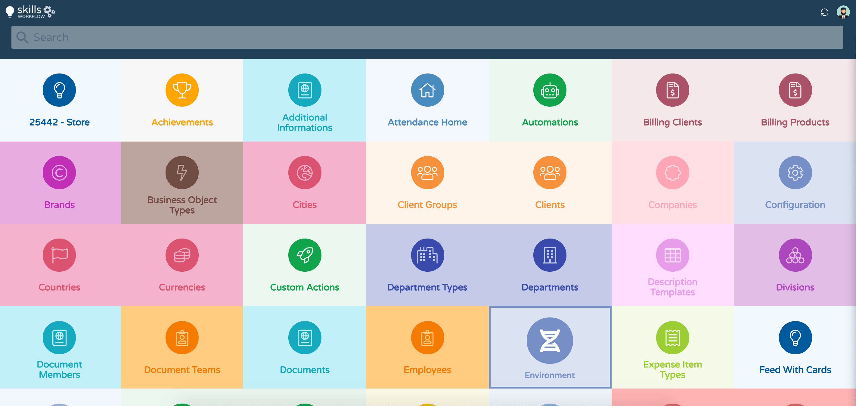
To access the Environment Dashboard, log in to Skills Workflow, click on your username in the top right corner of the home page, select the "Maintenance" option and press the "Ambient" module.
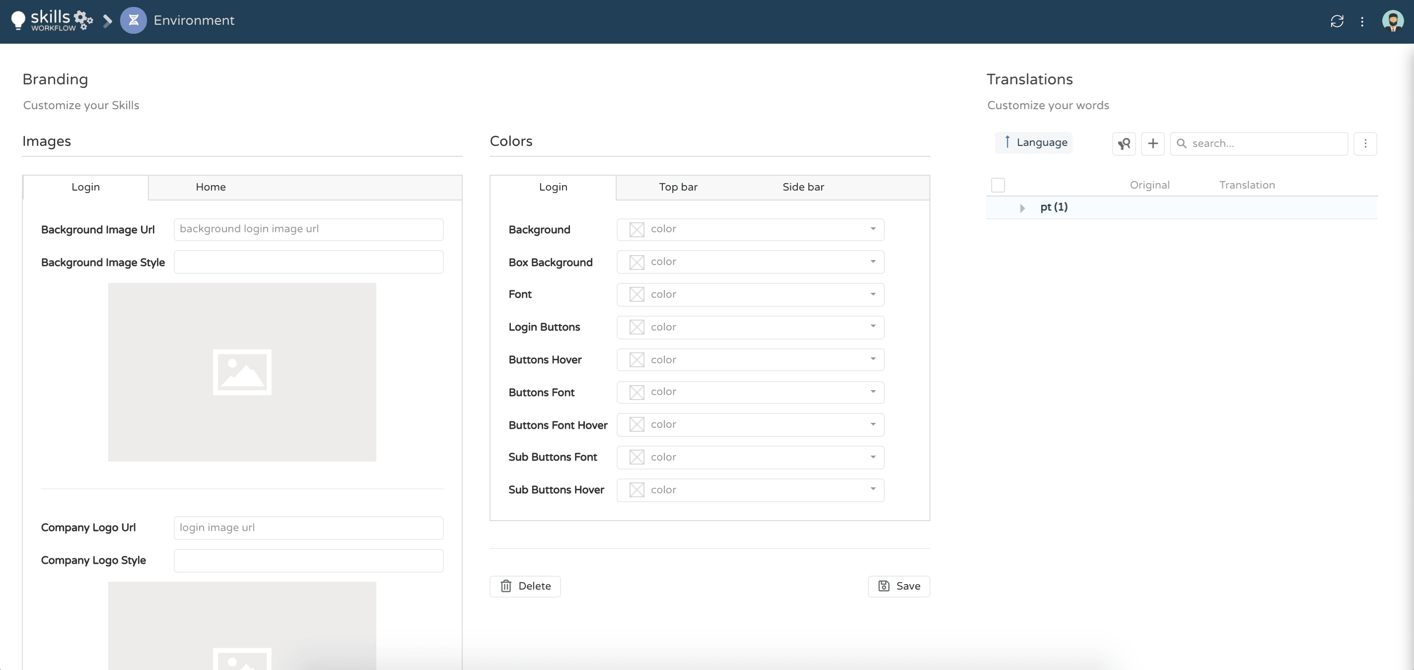
There are 3 sections in the Dashboard where the following are defined:
-
Images: images to use as background and company logos.
-
Translations: terms within the system that can be renamed as needed.
-
Colors: Colors to be used for the background, icons, bars, and fonts.
-
Background Image URL – Enter here the URL of the image you want to use as the background for the login page. Select images that can relate to your agency. Avoid images with lots of objects/noise. Prioritize images with depth of field.
-
Background Image Style – Enter the style properties to apply to the image.
-
Company Logo URL – Select a logo that is common to all companies within the instance, preferably with a transparent background.
-
Company Logo Style – Enter the style properties to set the size of the company logo.
Home tab
-
Top Bar Image URL – Logo you want to place at the top of the vertical menu bar on the left of the home page. The same logo as the login page can be applied. The logo must not exceed the limits of the bar and must be aligned with the breadcrumbs and menu items.
-
Top Bar Image Style – Enter the style properties to set the size of the top bar image
Translations
- Press the + sign to add a new row
- Select the original term and write the new one that you want to see in the system
Colors
-
Login Tab – Define the colors for the different components found in the login box on the login page.
-
Top Bar Tab – Define the colors for the different components found on the top horizontal bar of the home page.
-
Sidebar tab: defines the colors of the different components found in the left vertical bar of the home page where the system menu is displayed.
To configure the colors, simply type in your color code or click the dropdown menu and the color guide will be displayed. When selecting colors, make sure there is enough contrast between the background and the fonts/icons. Hover State should be more visually appealing than normal state
Once you have configured the images and colors, click the Save button to save your changes.